
In the video about movie posters, James Verdesoto explains how color, framing, contrast and shape can influence an audience and a movie theme. Covers pitch an idea of what to expect from a film and capture the audience’s attention by making them want to know more. Why is this person running? Why is there just one guy standing alone? Why are the letters super big, and why is everything blue? These attention-seeking additives in the poster can be expressed through clothing, setting, props, facial expressions, and especially color. The use of negative space in posters is also very important and a big part of the film poster industry, It lets the audience focus on what is important.
James talks about how color in movie posters can affect the audience and how some colors are mostly associated with types of movies. A white background is often used to advertise comedy movies as it shows the action to be more prevalent, especially with lots of negative space. It makes the audience focus on the main thing the producers want you to focus on and doesn’t give too much away from the movie itself.
Blue is frequently used in thriller posters and often has a person running away from the camera in an ally way. There are usually silhouettes and some sort of physical action in these posters that grab the audience’s attention by making them want to know what they are running from and why it is so secretive.
Yellow is usually for smaller/independent movies because it is a cheap way to catch the audience’s eye. Bad-quality photos are often used for these types of movies and may have different organization techniques for them. Just because these movies were made by a smaller company does not mean they are bad.
Punk rock aesthetics often include large cutouts, bold text, and bold images. Black is also often a common background color, but because so much is usually happening on the poster, it’s hard to see what the background actually is.
Indie comedies (instead of having a white background) commonly use yellow, even though it is roughly associated with smaller movie companies. They often use negative space to their advantage and may have some sort of action that isn’t necessarily a negative or essential action towards the storyline or theme. An example would be someone running to catch a bus. The movie isn’t about someone constantly running to catch a bus but maybe the movie is about missed opportunities.
Black, white, and orange are often action films that include the main character’s face with a very serious look, action, pose, cars, masculinity, and fire or explosions. They usually show the conflict on the poster with the main character who will defeat this conflict and walk away slowly from a burning building, confident in winning and destroying everything around them.
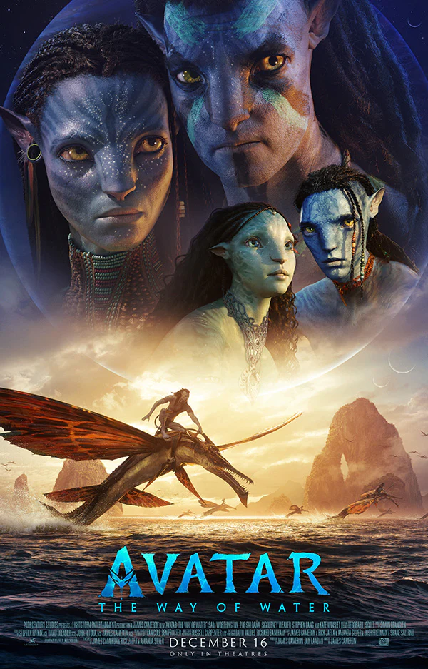
Blue and orange movie posters usually portray another universe/characters, being blue and orange being the narrative/storyline. A good example would the the movie Avatar: The Way of Water. They have the characters and even the planet they live on which is different from our own in the blue upper part of the poster and the yellow on the bottom showing one of the characters riding an animal we haven’t seen in this movie series before meaning there will be something new to learn from this second movie.
When it comes to time and the expression of time in movies, some producers decide to physically make the movies they are making seem more out of date or imperfect to get the right feel for the time period this film was made. With Stranger Things, they used popular fonts from the ’90s and even included imperfections that were common during that time in the movie to make it seem like it was made back then. There are a lot of different ways people have edited their movies to look different from modern ones to make them seem older or even newer.